Building Recko Design System
Recko (acquired by Stripe) enables AI-powered reconciliation of digital transactions & keeps track of the complete transaction lifecycle for organizations. Around Q2 of 2020, the company had few early B2B customers (Myntra, Lenskart, Dunzo, Licious), and the product was growing in complexity. It was a good time for someone to come in and standardise a few things to bring consistency across the product.
Parikshit (Recko Design lead) approached me in June about building a design system at Recko. They needed someone to take ownership and lead the design process.
This sounded perfect for me, as I was playing around design systems for a couple of years then. But in previous projects, building a design system was always a side thing that I did while working on other product features. This time, it was my primary focus.
TL;DR
-
Preparation
Recko team culture, product vision and other development practices. -
DS foundation
Defining the foundational items of the Recko Design system. -
DS component library
Designing reusable UI components as a Figma library. -
Adoption
Making efforts to invoke a sense of trust about the DS in design and dev team to improve adoption. -
Impact
1. Preparation
First 2–3 weeks, it was all about conversations. When I started, Recko was a small company with less than 50 people. I didn't know many of the team members; wasn't aware of the team culture, product vision and other development practices that the team followed.
I made it my primary task to understand these aspects of Recko before moving on to the next step. Discussions with Saurya (CEO) and Prashant (CTO) gave me a sense of their vision for the company. On top of this, inputs from the product, marketing and sales teams helped me get alignment on Recko's personality in the outside world.
We then went on to define the Recko Design Principles. The principles aimed to enable conversations, guide the thought process and help reach solutions to product problems. These principles became the core of how we built experiences at Recko.
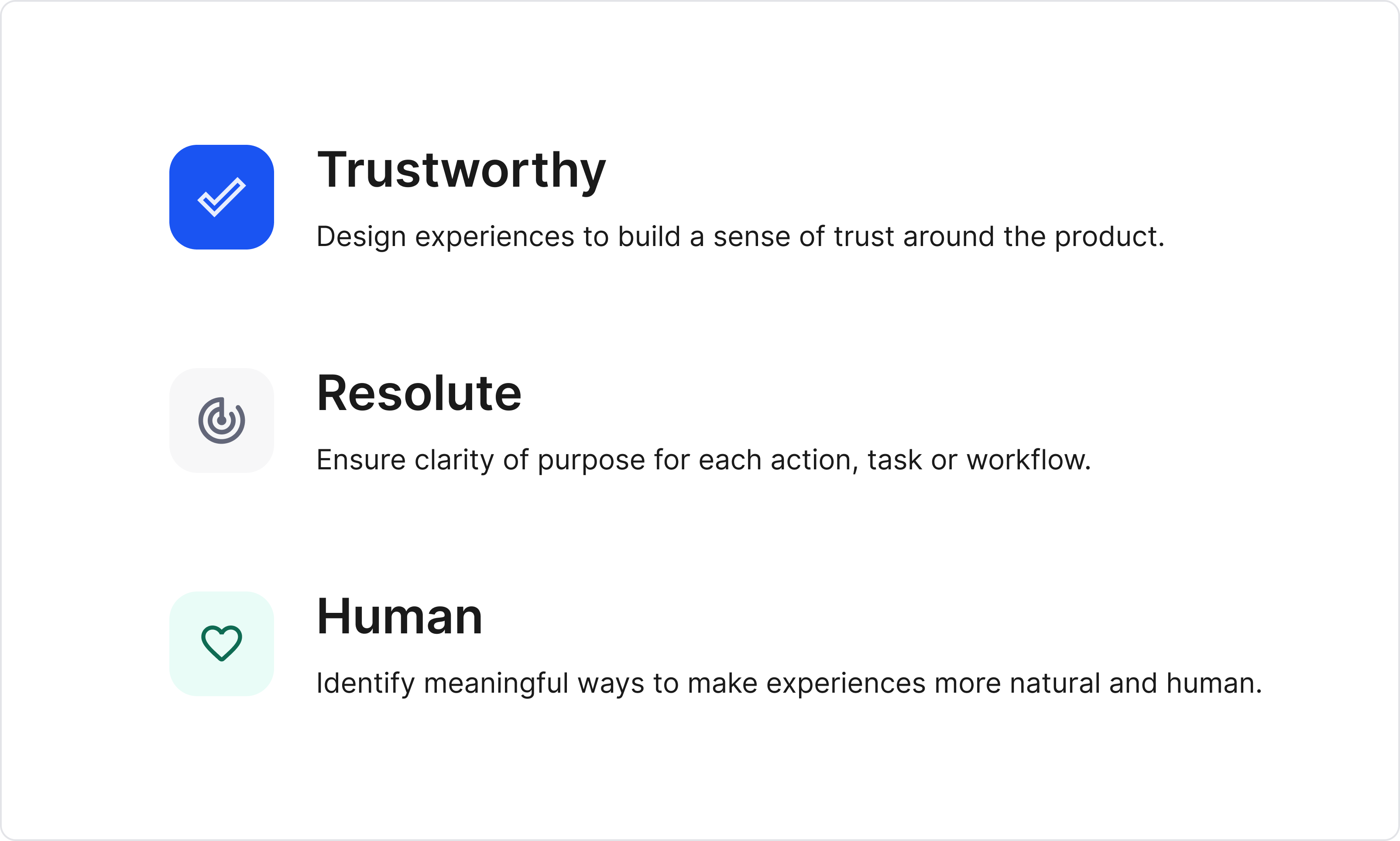
Recko Design Principles
Click here to read more about the Design Principles.
In some cases, teams start the design system without design principles, which may work too. But it really helps to have principles as a north star while building the design system.
UI audit
In parallel with the principles, I started the process to audit the then existing product interface.
This exercise allows getting a bird's eye view of the product on a component level and can be used later to prioritise component creation. This also serves as an archive during the later stages of the DS building process.
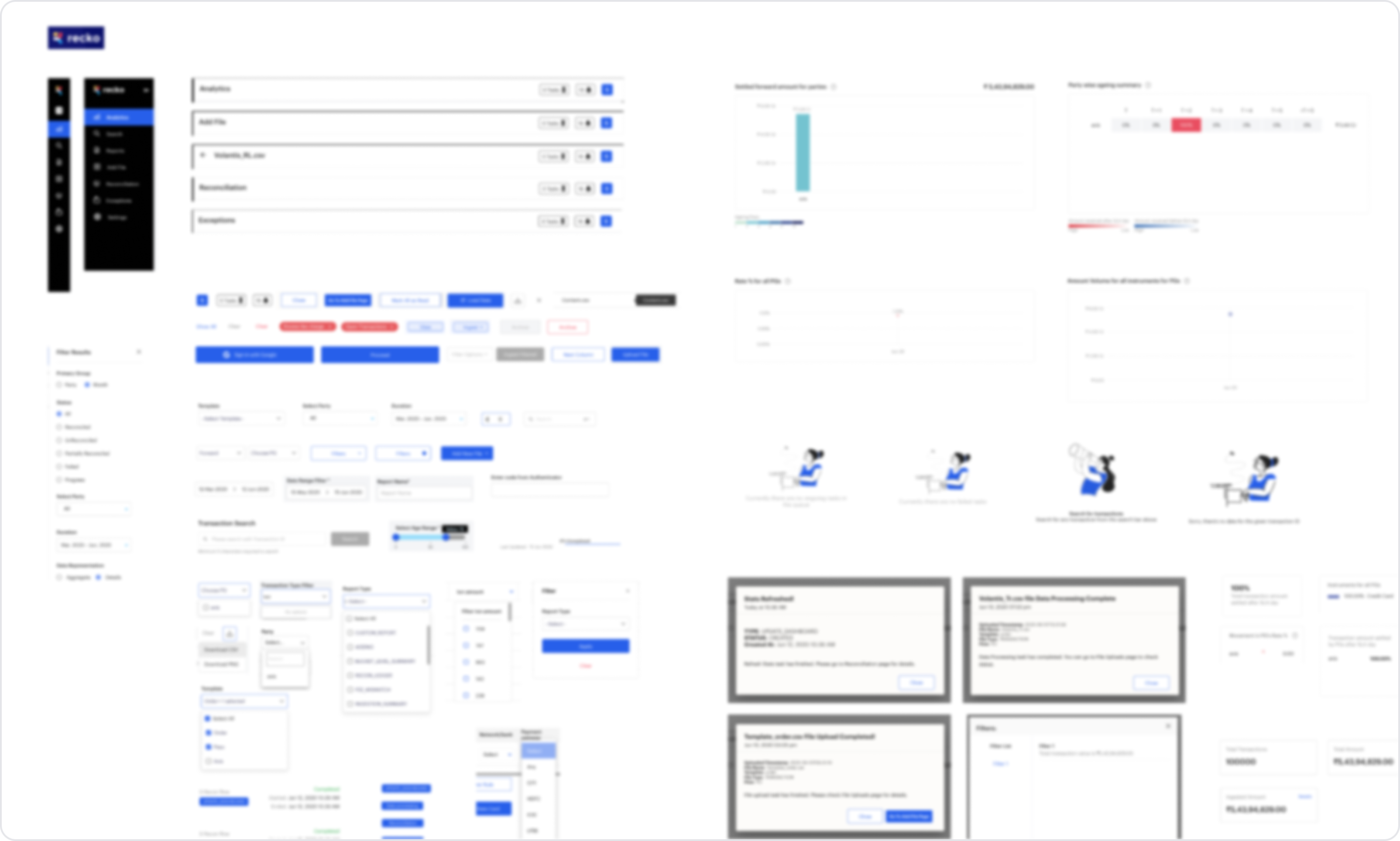
UI audit (blurred)
Here are the items documented in the audit:
- Compilation of every single UI element and its variations.
- Page layout grids used in the product. e.g. pages using full width, pages with centre-aligned content, pages with sidebars, modals etc.
- Typefaces used and their purpose.
- Iconography
- Colour palette (different hex codes) used across the product.
Finalising the stack
The team decided to use Figma for Recko Design system. Managing styles and components is a breeze on Figma, and we had no second thoughts about going ahead with the tool.
For documentation, I had gotten used to and hence preferred Notion, so did most of the other members in the design team. But rest of the org was on Google docs. So we went ahead with Google docs.
As it turns out later in the building process, we learned that the dev team was more comfortable in Figma handoffs; and we eventually started documenting everything (components, behaviour, edge cases etc.) in Figma itself.
First few weeks of documentation in Google docs
2. DS Foundation
Till this point, all I did was wrap my head around what Recko did and set some basic guidelines for the things to come. In the next few weeks, we defined the foundational items of the Recko Design system.
I go by the following order while defining the foundational items of a design system:
- Spacing scale
- Layout and column grid
- Type scale
- Color
- Icon library
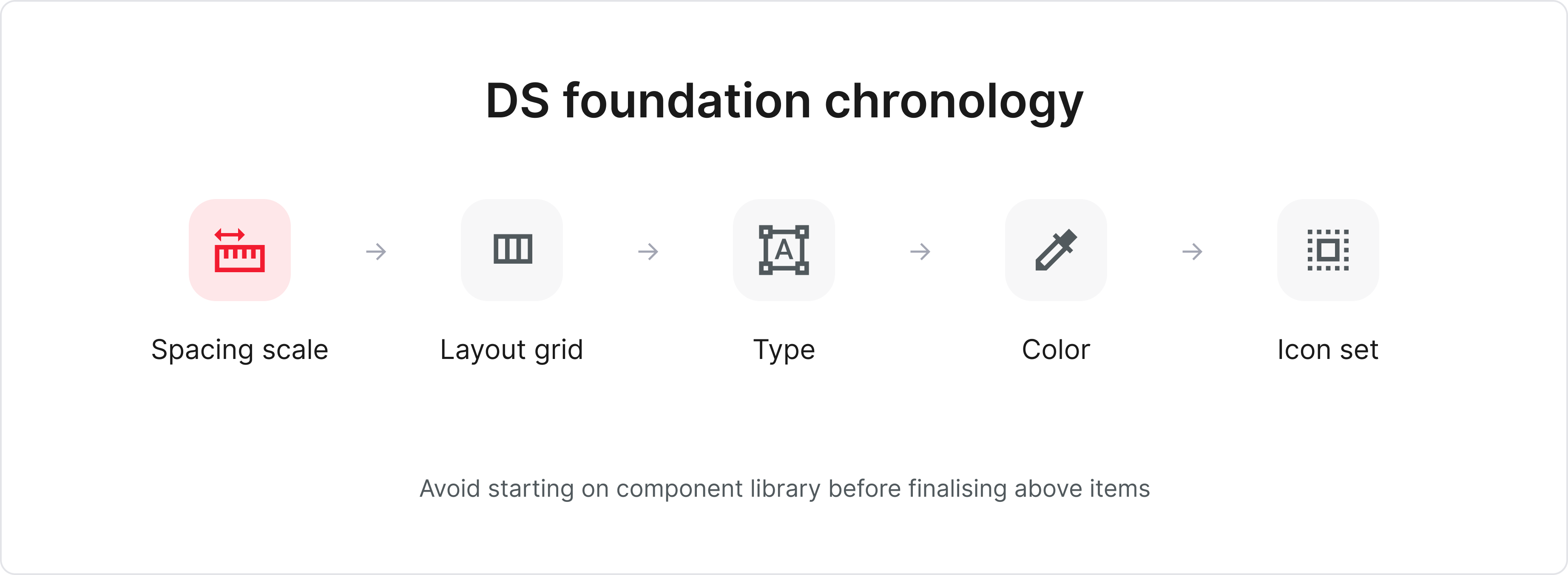
The above order ensures that we don't have structural debt while defining a particular item. e.g. If there is no concrete definition of spacing scale, it becomes tricky to define the layout grid.
Even though the above order is ideal, but in the real world, there will always be tight deadlines to follow and seldom will you get the luxury of time to define each item exhaustively.
So it is usually a good practice to define the bare minimums for each step so that it doesn't block the next one and try to refine later; allowing you to keep things moving.
1. Spacing scale
We (design and front end team) decided to use 4px as a base unit for all our measurements in layouts and UI elements across the platform.
This means a 4px incremental scale for:
- margins and paddings in the UI elements
- sizes for all components
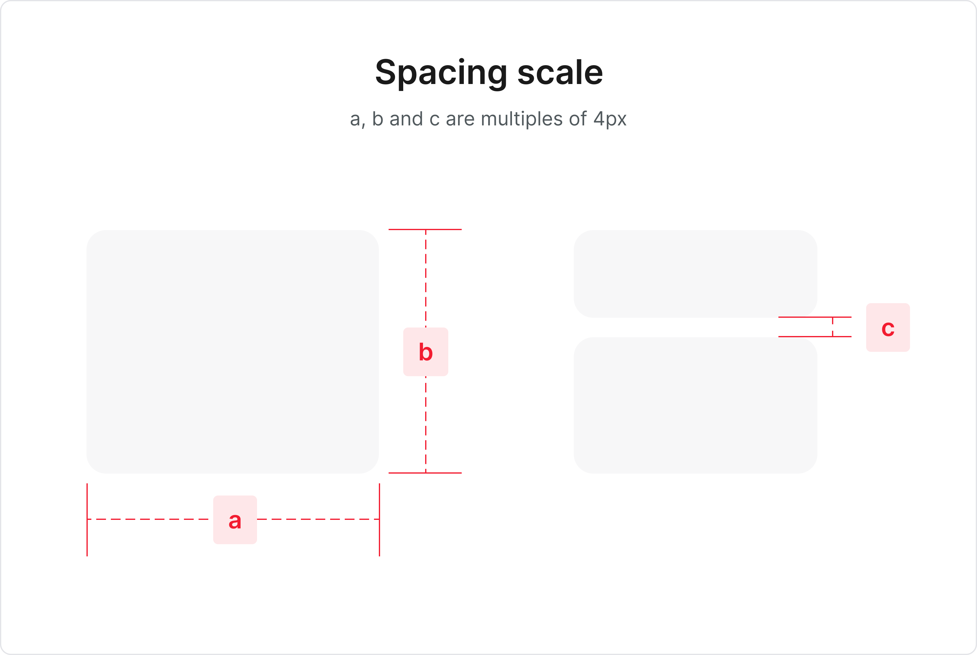
We made sure to involve the front end team while finalising the base unit. The cherry on top would be if the front end team creates classes based on frequently used spaces (e.g. classes tiny, small, medium for 4px, 8px and 12px respectively and so on).
This also ensures that the dev team talks in classes instead of pixels, bringing quicker adoption and fewer chances of errors.
2. Layout and column Grid
Recko DS was being developed for desktop first. To streamline the process, I usually follow these steps to narrow down on the layout and column grid for a particular page in the app.
- Identify different page elements and layouts
- Choose an n column grid
- Define column grid margins and gutter
- For each page, identify the page elements and define the best possible grid behaviour
2.1. Identify different page elements and layouts
Using UI audit document, we identified and categorised different page elements and layouts used in the app.
Here are a few examples of page elements and page layouts.
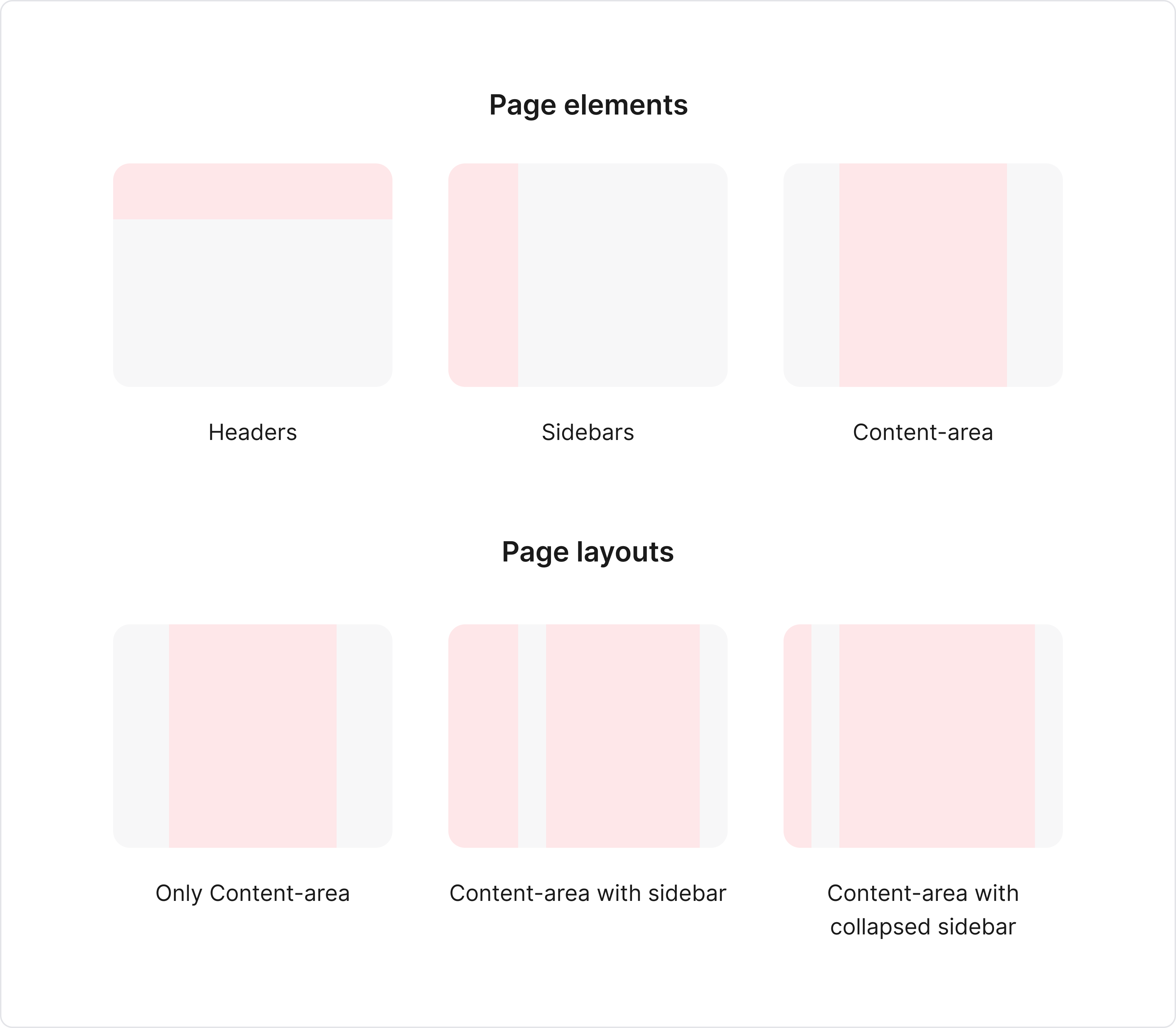
Examples of different page elements and layouts
2.2. Choose an n column grid
We decided to use the 12 column grid for the content-area
(canvas) of the app.
Reason being 12 columns grid is easily divisible by 3, 4 and 6; conveniently dividing the content-area into 4, 3 or 2 columns respectively. Also, the design and dev team were well versed with the 12 column grid. So that helped too.
In this scenario, the sidebar (if any) remains fixed width, and the remaining area can be taken up by the content-area (12 column grid).
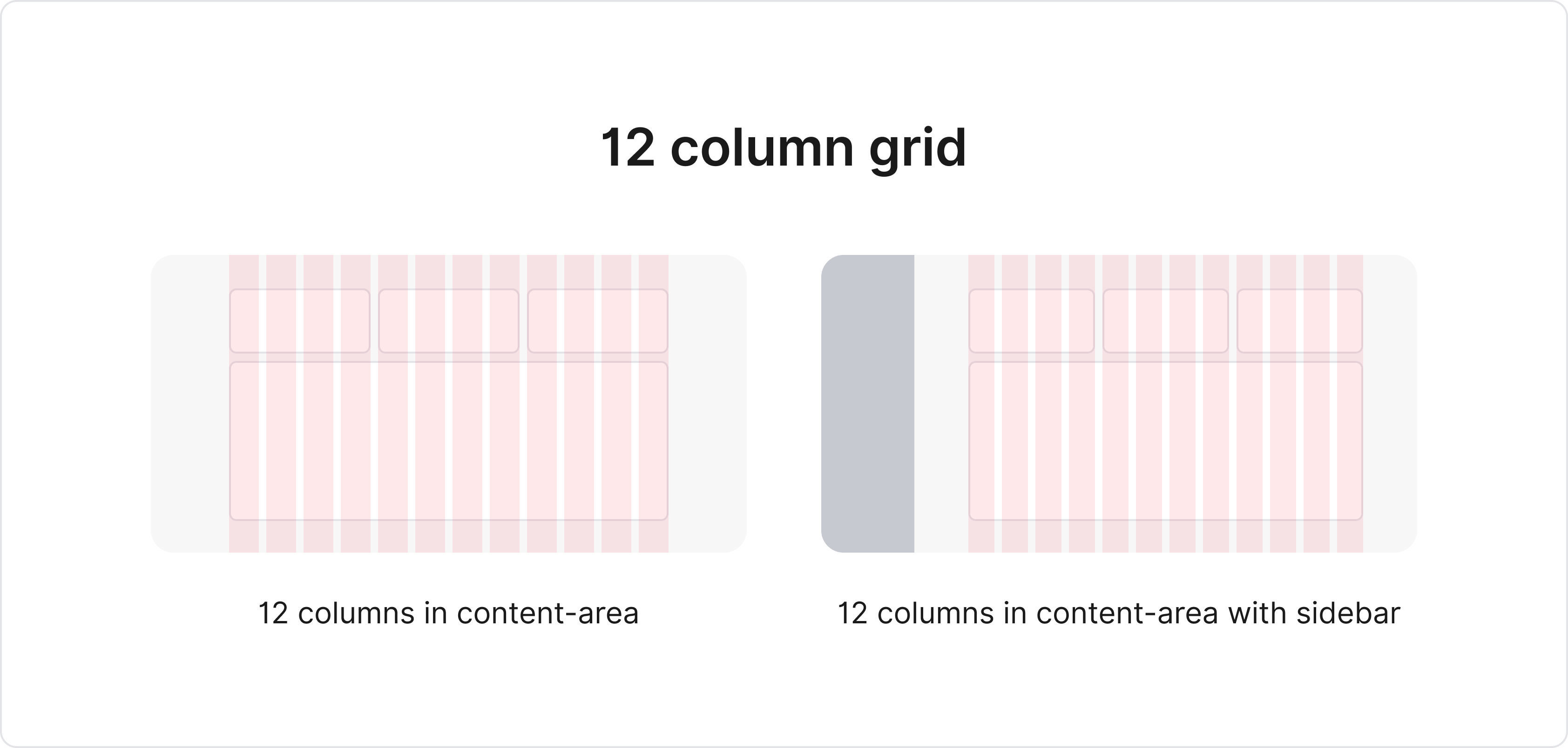
12 column grid for content-area
Other option can be having a percentage based layout - wherein the entire page is divided in percentages. e.g. 20–80 percentage scale for sidebar and content-area.
I prefer the former option, as it gives more control handling the content-area items; but I have seen teams successfully use percentage-based grids in the past.
2.3. Define column grid margins and gutter
Grid margin is the spaces on the left and
right edge of the content-area grid. Gutter space is the space between 2 adjacent columns in the column
grid.
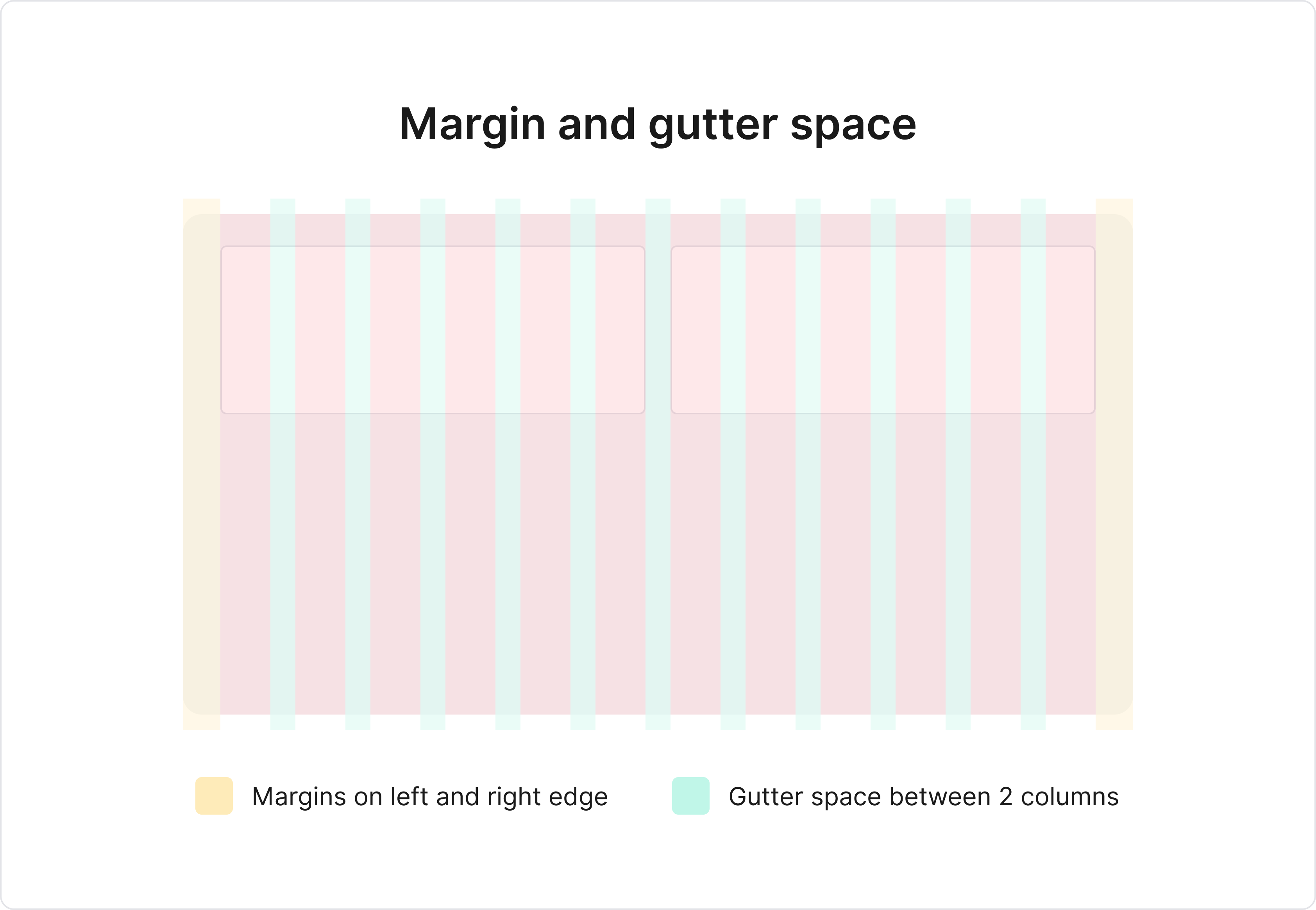
Ideally, we try to keep the values for both grid margin and gutter constant across the app. e.g. In case of content-area with sidebar, even though the available area shrinks in width, the reduction in width should reflect in individual column width, not in grid margin or gutter space.
Also, grid margin is applicable only when the entire available width is used to display content. If the content is centre aligned with some max-width, the margin is set automatically.
2.4 For each page, identify the page elements and define the best possible grid
behaviour
Once global attributes were set, we started to scan each page to identify the
repeating page elements and define the content-area grid behaviour.
E.g. content-area in some pages will be centre-aligned (in forms for more focus) vs in some pages content-area will be spread in the entire available space (in dashboards for more visibility).
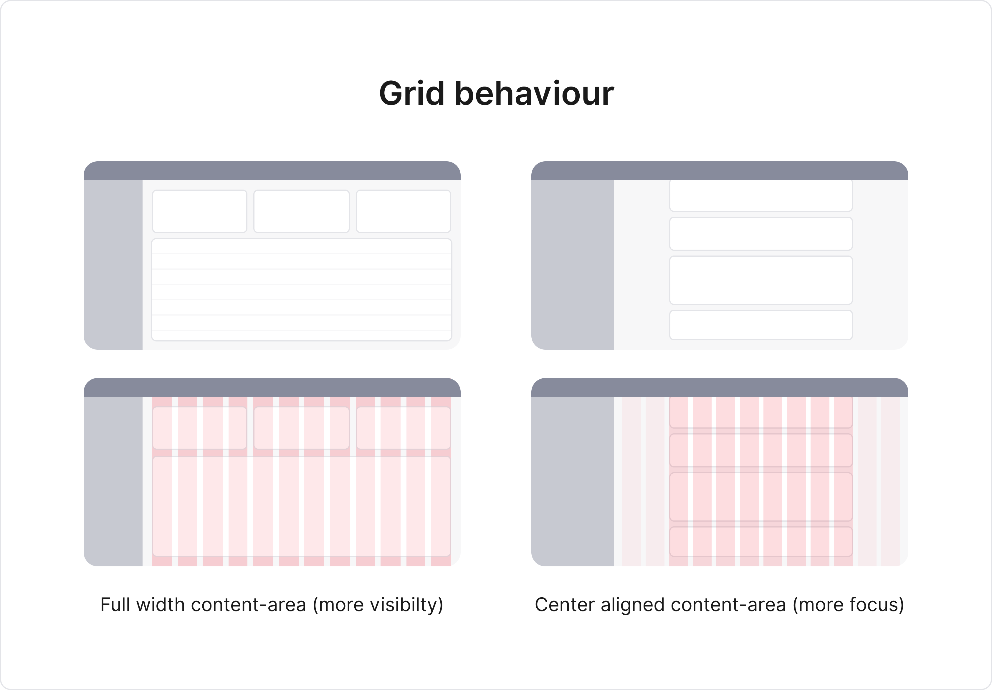
Grid behaviour based on context
This step is context driven, and the grid behaviour for each page may vary based on product context.
3. Type scale
In this step of DS foundation, we covered the following items:
- Choosing typefaces to be used across the app
- Defining a type-scale for each typeface
One thing to note before moving to typeface shopping - we had decided to follow a line-height based grid (vs baseline grid). Reason being it is easier to manage in Figma and has a better CSS support than baseline.
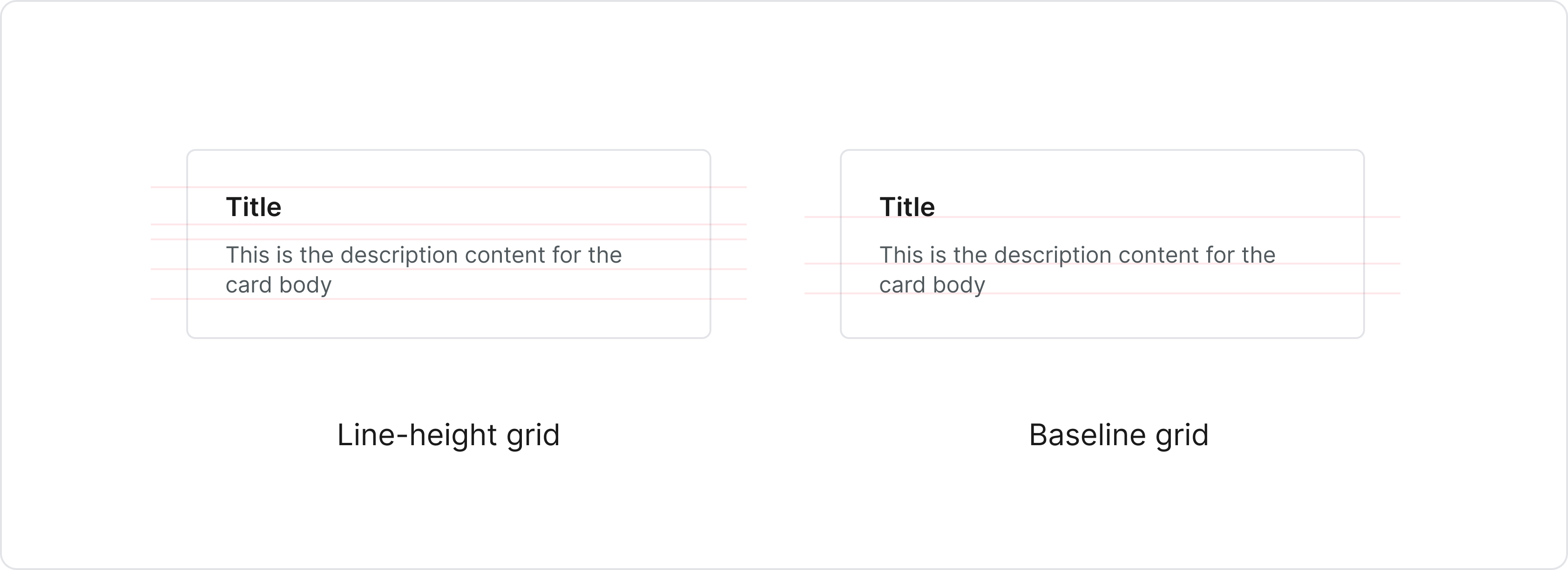
For a given typeface, each font-size is tightly coupled with its line-height. But we chose to have variations in font-weight for each size to improve flexibility.
In my experience, teams are less aware of this coupling of font-size and line-height. Since all UI specs revolve around the line-height, it becomes vital to ensure that they understand this relationship and practice it.
3.1 Choosing typefaces
To begin, the UI audit document became a good reference to narrow
down on the typefaces and their respective font-sizes. Graphik was used as a primary typeface across the
app.
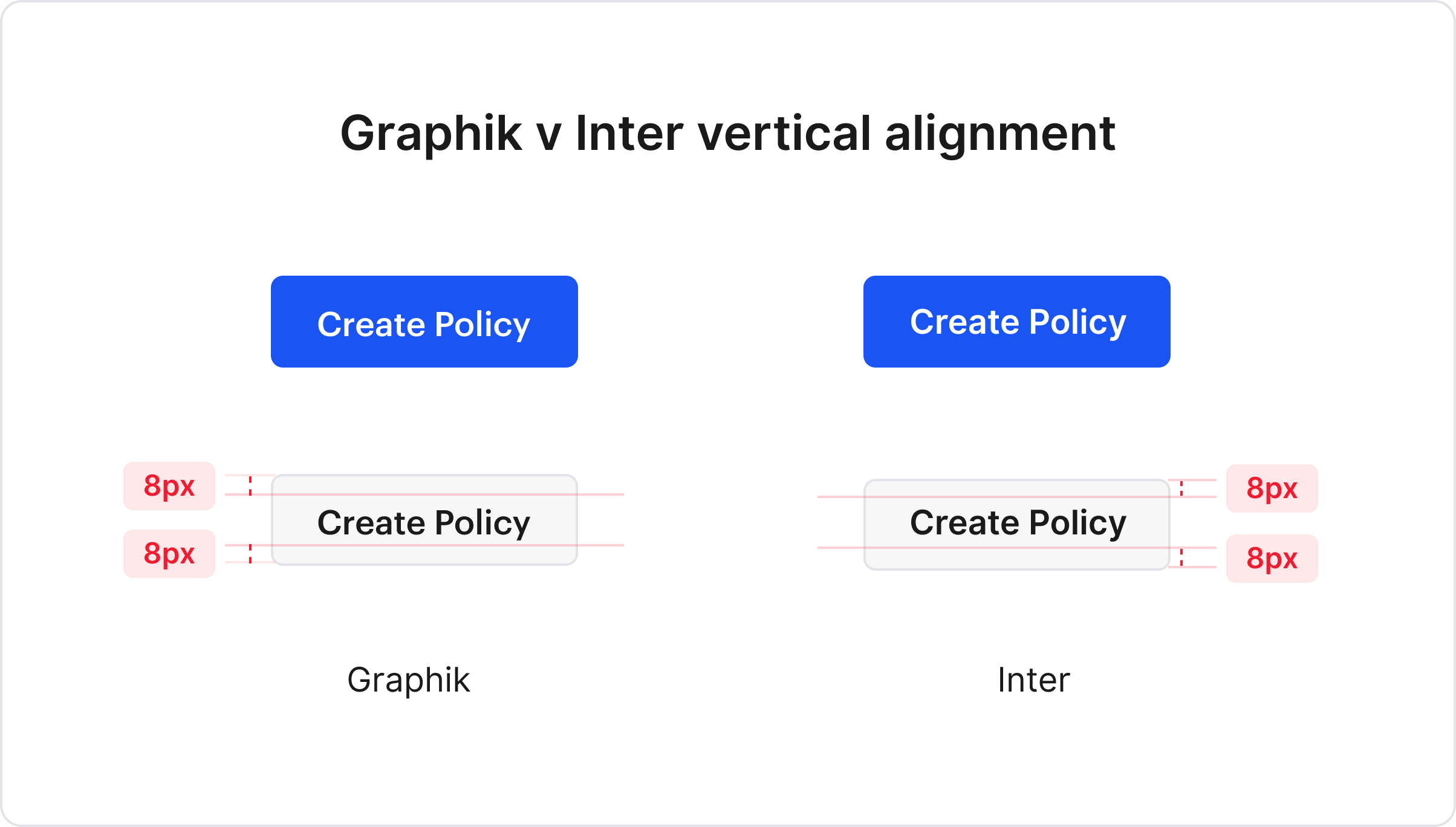
As it turned out, line-height was not thought out while implementing the typeface in the designs, and this was causing an issue. Graphik is a beautiful typeface, but while implementing it in UI elements, it did not align well vertically. It felt a little bottom-shifted.
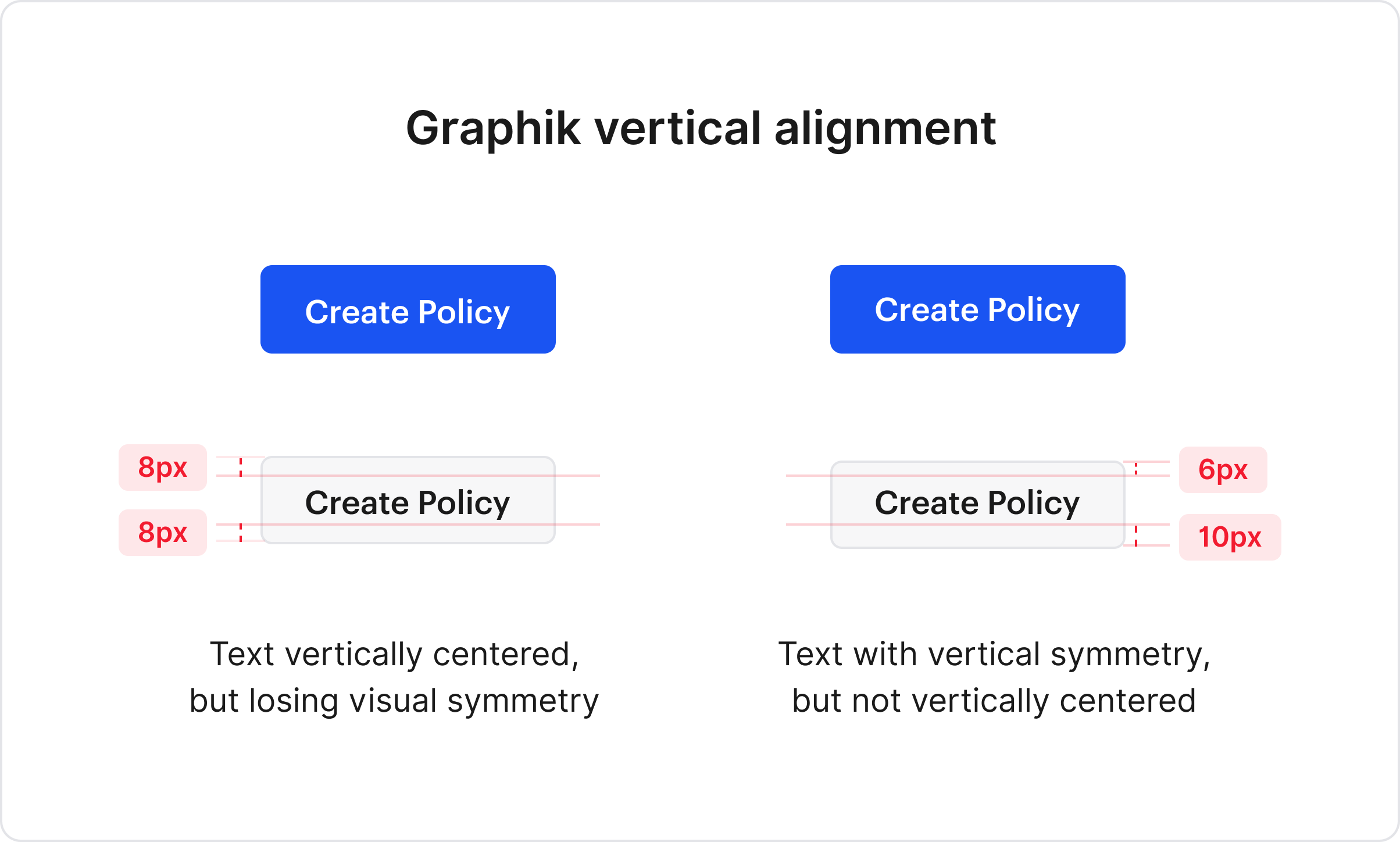
This seemed like a small issue until we tested it with Figma auto-layout for creating the component library. In July 2020, Figma did not support variable padding vertically, and the components looked something like this:
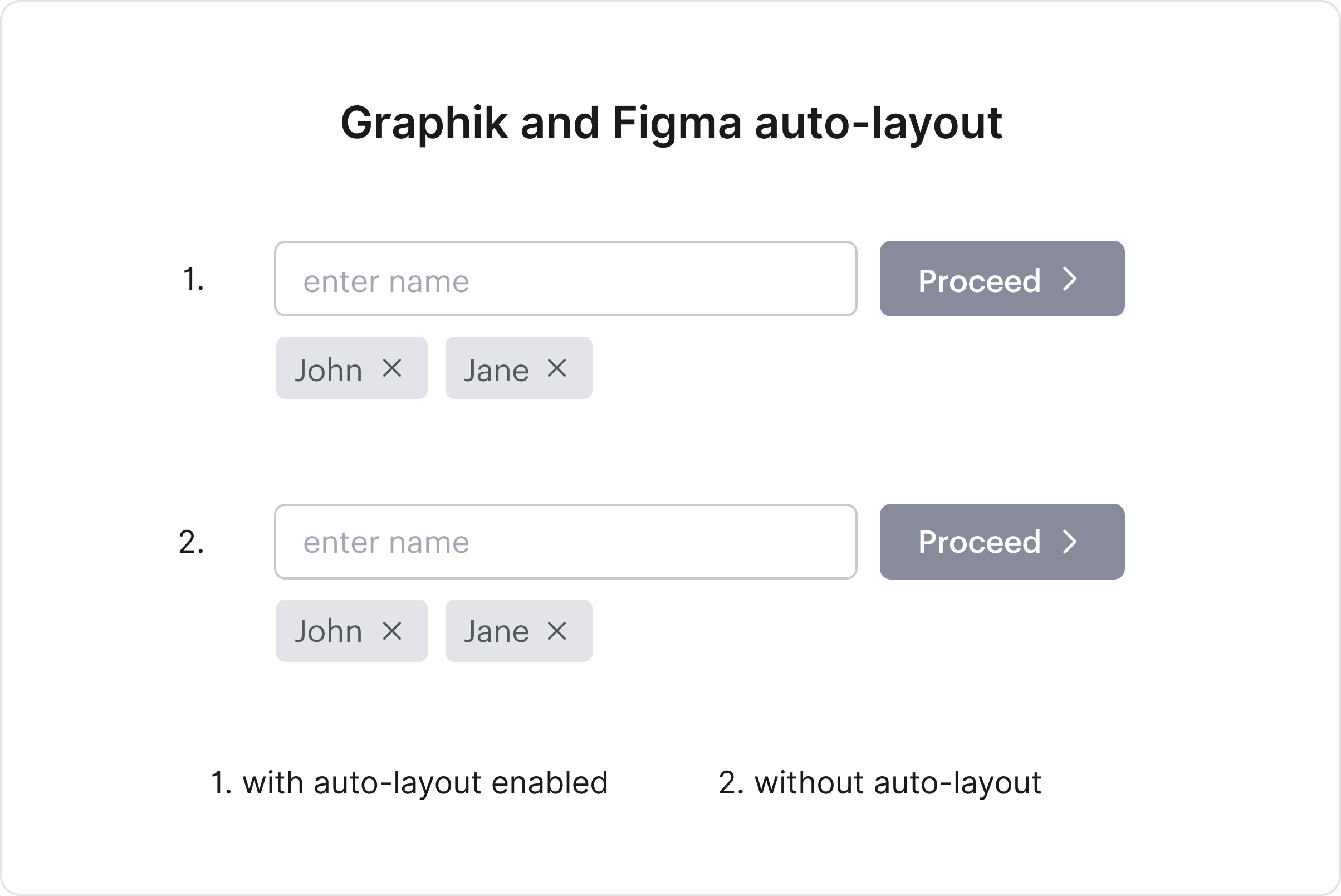
At the time of writing this, Figma still did not support variable padding vertically. We tried a couple of workarounds, but it felt like a compromise. Hence we decided to update the typeface - something close to what we had, but one which could solve the issue.
Choosing a new typeface involves many considerations and simultaneously trying to answer the following questions:
- Does the typeface appropriately reflect the brand's identity?
- Will a single typeface suffice for both product and marketing content?
- How will a typeface affect product performance?
Answer to these questions varies depending on the type of the company and the target scope of the design system.
On experimenting with various options, we decided to use Inter as a primary typeface across the app. It is close to the earlier typeface, thus not giving a visual jerk reaction to the end-user. It has enough weight variations to choose from and loading times are quick too; and most importantly, it solved the vertical alignment issue.
3.2 Defining a type-scale
Reducing the number of font-sizes to be used across the system
improves consistency, but can be limiting as well. This was our purpose of defining a type-scale: to define
a set of font-sizes and respective weights to be used in the design system.
The aim was to keep a balance between limiting the number of sizes, but also gifting flexibility to designers by allowing variations in weights.
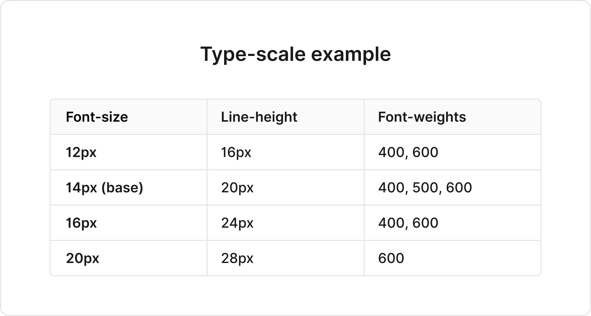
As mentioned earlier, each font-size is tightly coupled with line-height; and the line-height follows a 4px scale we defined in the first step.
For defining variations in font-weights, I usually follow a simple rule. The farther away the font-size is from the base size, lower the number of variations in font-weight.
e.g. Base size has the most number of variations for flexibility, and bigger font-sizes (usually headings) will have not more than one font-weight for consistency.
Note: We did not define the styles, but only the scale. Designers were given the freedom to play around with text content based on context while creating a particular component.
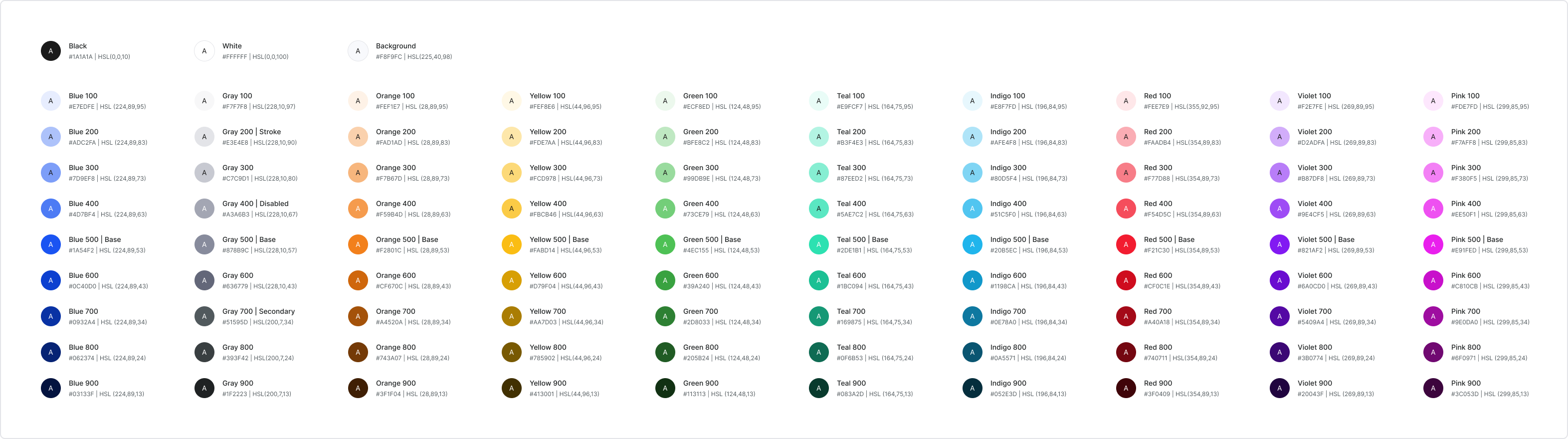
4. Colors
Building a color palette for a design system is a lengthy exercise, involving collaboration from multiple departments - graphic design, marketing, development and business teams. Also, it entails considering numerous aspects like target devices, target audience, accessibility and so on.
But with stiff timelines, this step can become a bottleneck for creating the component library. So to avoid slowing down the entire process, we followed the bare-minimum rule.
We figured bare minimum would include finalising hex codes (or HSL) for the following items:
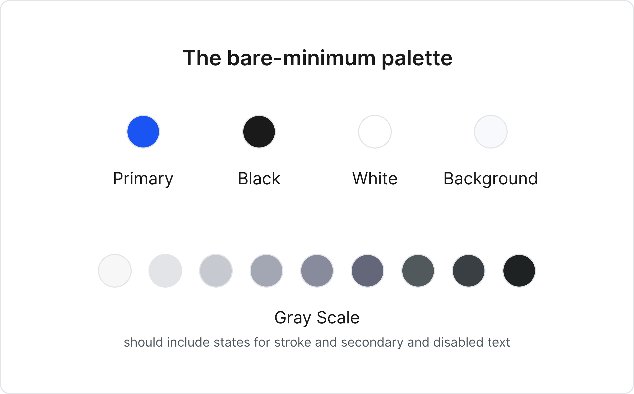
These colors allowed us to get started on the component library. Primary color took care of all the enabled or active states of the components. It was essential to freeze on a background colour as it can easily change the mood of the entire page.
Defining the Gray scale meant we had fixed hexes for stroke, secondary text color and disabled states for the component library.
We had the necessary foundation laid for the color palette, allowing us to move to the next step. Rest palette was built in parallel as we made progress.
5. Icon set
Unlike other UI elements, icons have a unique way of conveying information to the user and are fundamental to the design system. Icons are not as attention-seeking as illustrations but are capable of providing helpful context in places of uncertainty.
Each brand should have its own icon-set, but it is also time-consuming to create one. This process of creating an icon-set, like color palette, can run in parallel while building the component library.
But certain things about the icons can be finalised before-hand:
- Recommended dimensions (should follow spacing scale)
- Filled vs outline icons and their usage
- Rounded vs sharp edges and their usage
Once we got this finalised, we searched for an open-source icon library that matched our requirements and used it till our icon-set was ready.
This was the last step in DS Foundation. We had laid enough groundwork to be able to start creating the component library.
3. DS Components
Components, UI library or UI kit in the design system is a collection of reusable UI elements in the app interface. The process of creating and documenting a set of components is well documented across the internet and hence won't go into too much detail here.
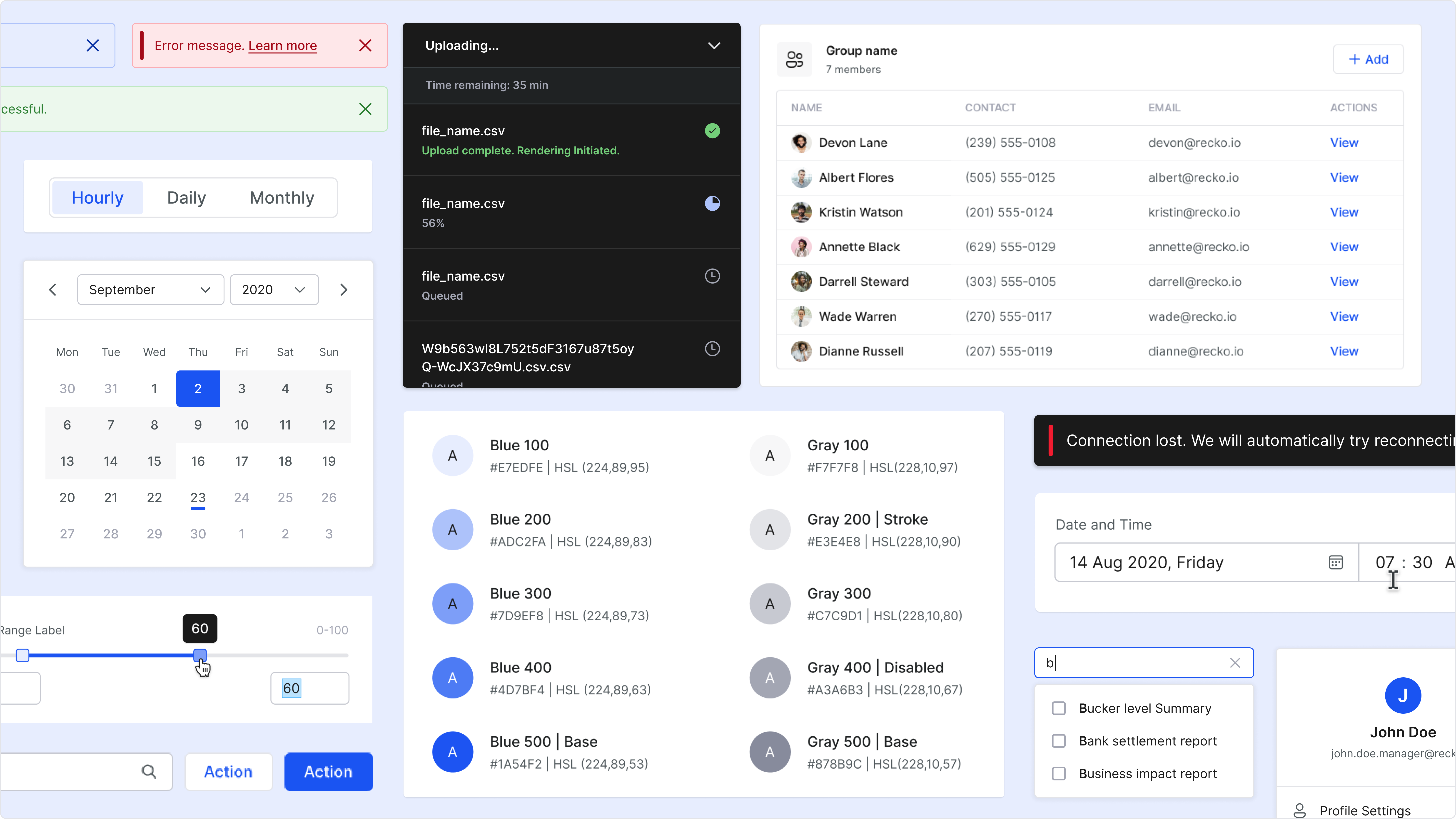
UI audit document helped us to narrow down and prioritise the order of individual component creation. The guidelines set in the DS foundation enabled us to maintain consistency on a very granular level for each component.
The whole effort to create, test and document the v1 of the entire library took us around 8–10 weeks.
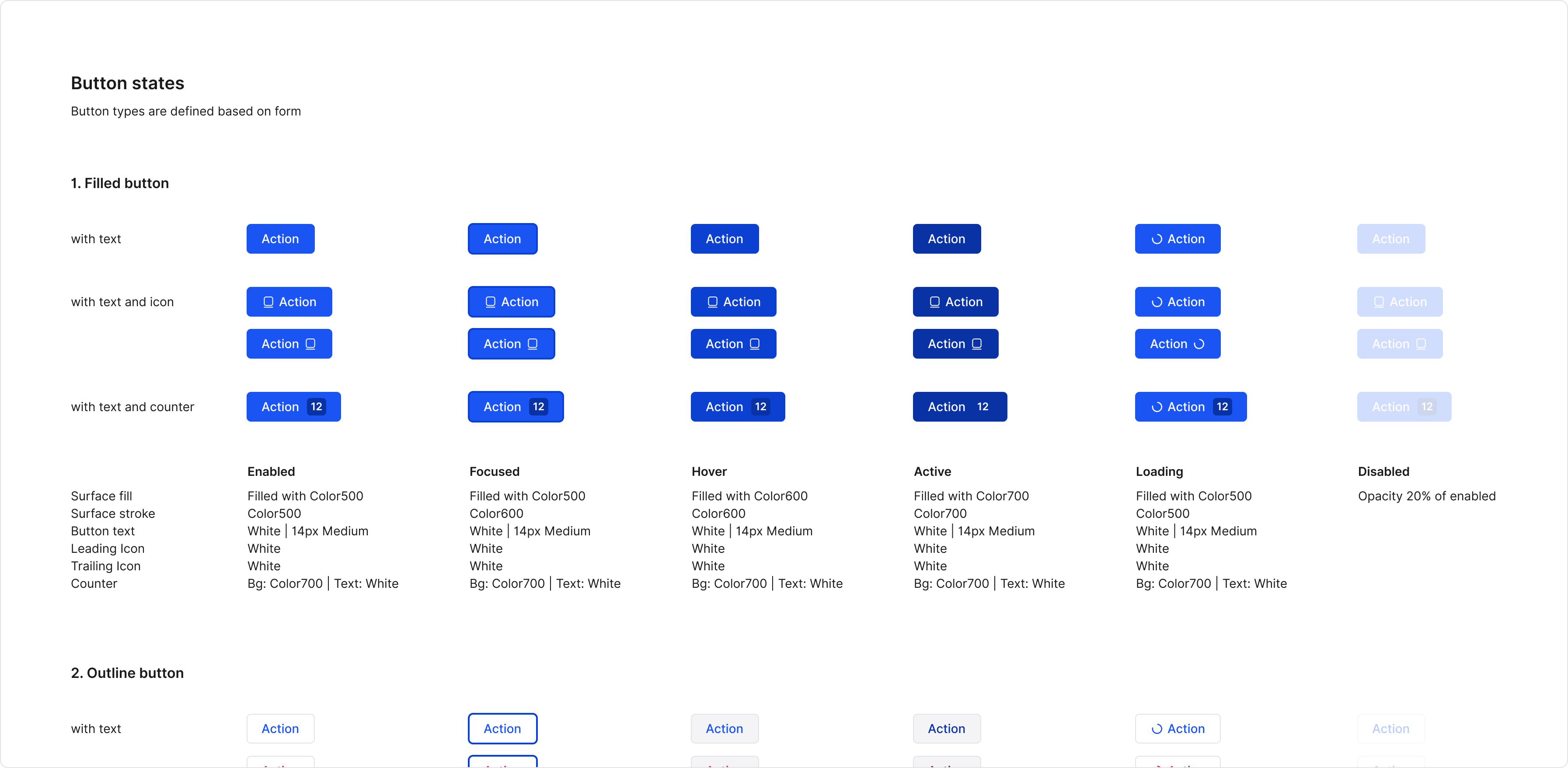
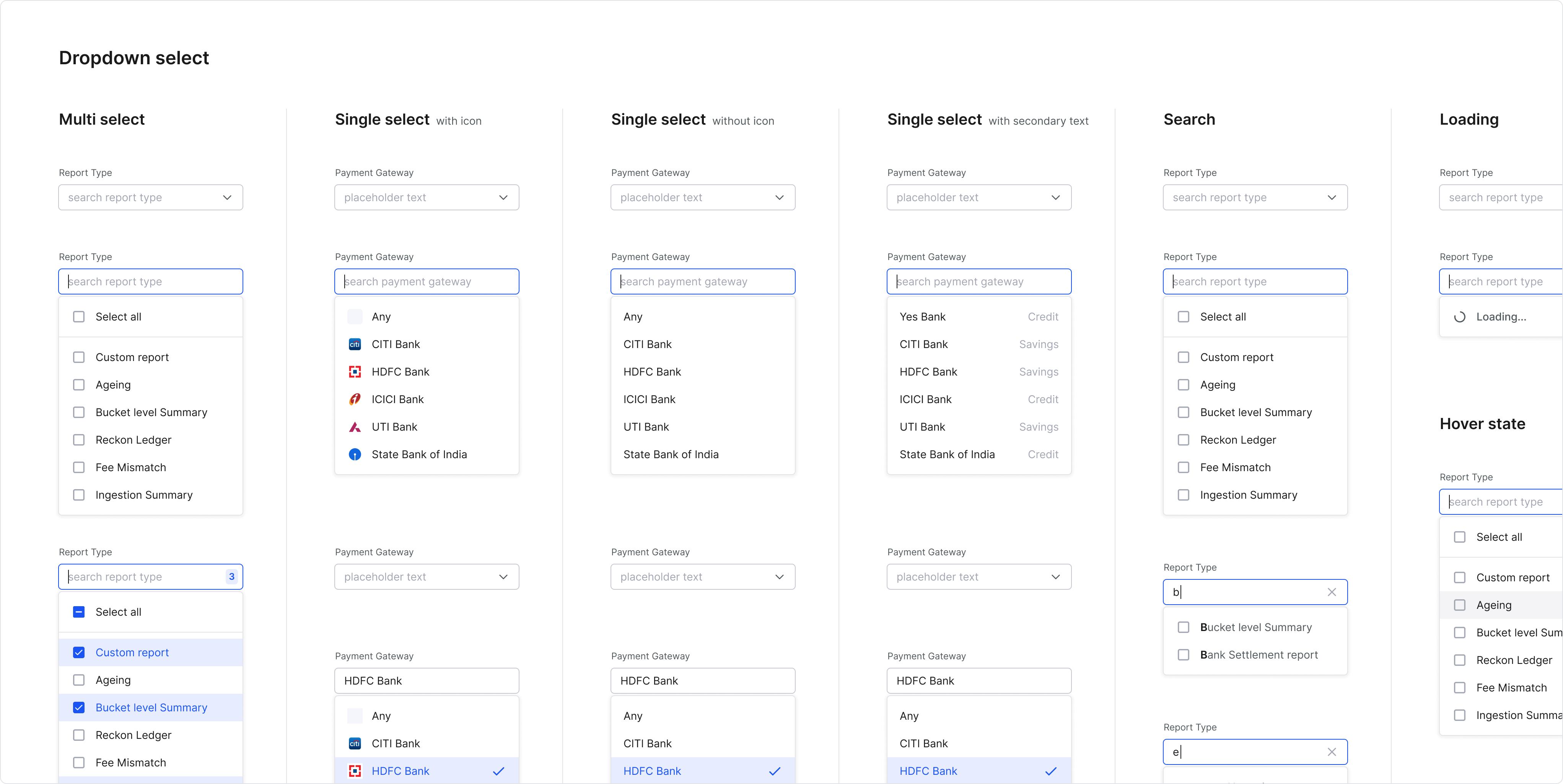
The front end team picked up the component development in parallel from the first week. Once the foundational items were set in code, things started to pick up speed.
The upcoming product feature is entirely built on the new guidelines and UI library by the front end team, and so far, the foundation feels pretty stable.
4. Adoption
To make the efforts worth, adoption of the design system guidelines and components by the design and dev team is critical. I feel the way to ensure adoption is to invoke a sense of trust about the DS in both the design and dev team.
The DS should give the designer enough flexibility so that they prefer not to detach that component or break that particular spacing guideline. At the same time, in cases where the DS falls short, the designer takes the onus to communicate and overcome the shortcoming in the next DS version.
All good developers take pride in writing clean code. There is always a hint of hesitation to override a class to handle edge cases or to accommodate deviations in design files; as it can come back to haunt them later.
Suppose the DS guidelines are appropriately set, with consideration of all use cases, and the design team is following the DS in their handoffs. In that case, there is no reason for the failure of adoption in the dev team.
To ensure this, I tend to practice the following things while building a DS:
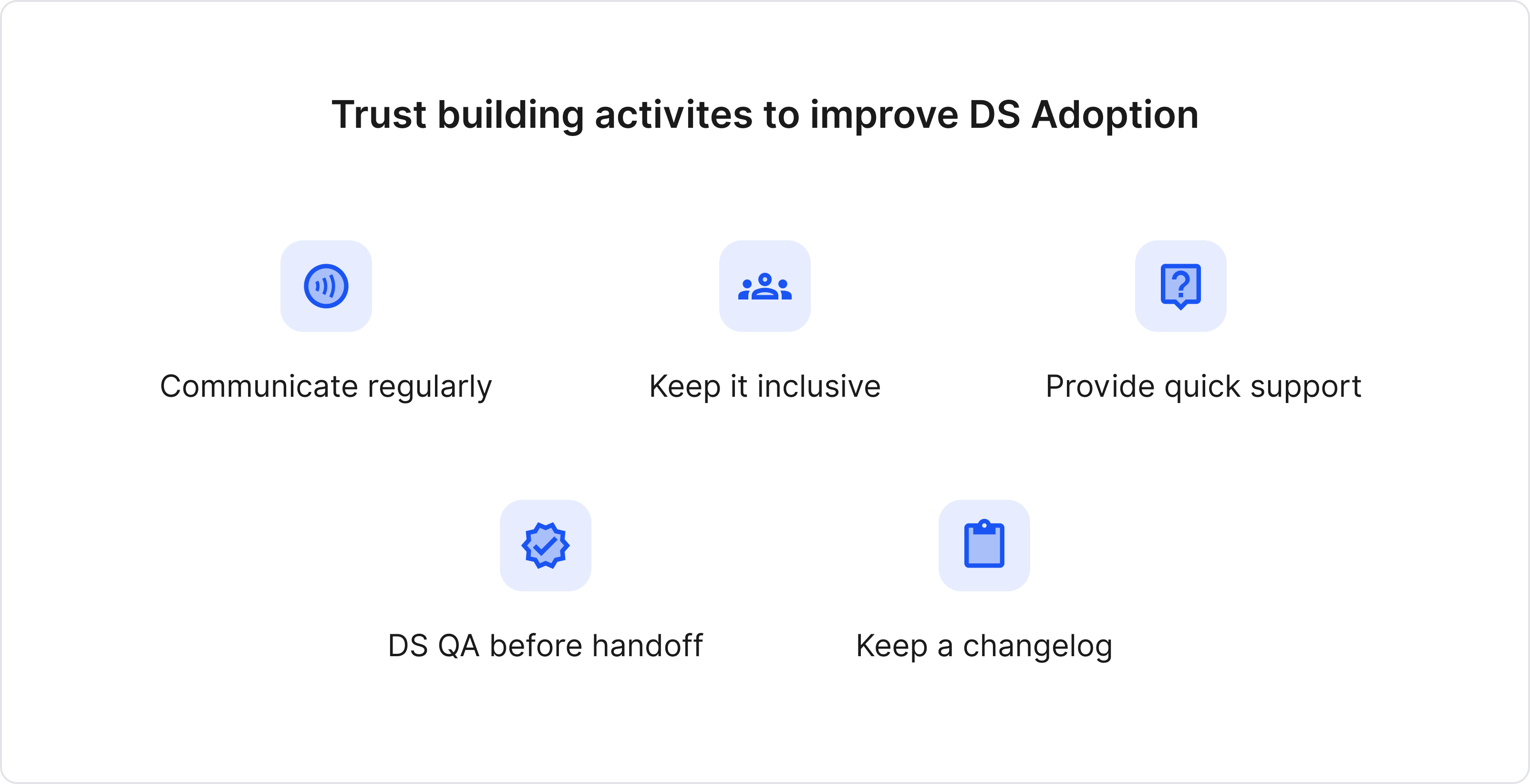
Communicate regularly
In the initial days, we used to have daily sync ups to discuss
progress on the design system. Even if we documented something, we ensured verbal communication across the
team. Once the necessary groundwork was laid, the sync ups were toned down to alternate days or twice a
week.
Keep it inclusive
Communicating regularly made sure we included members of both the
design and dev team in the discussions. Each brought with them particular expertise or product context.
Also, people hate when you expect them to follow guidelines without being consulted.
Provide quick support
Having a dedicated person to provide quick support in cases of
confusion or shortcomings was vital. Also, a dedicated slack channel became a common discussion place for
everything DS.
DS QA before the handoff
A quick design system QA before any design handoff helped to
identify and fill the gaps between DS and design implementation (if any).
Keep a changelog
A changelog is a timeline view of updates happening to the design
system. It helped improve visibility, monitor progress and gave a sense of momentum to the whole DS building
process.
5. Impact
Some of the insights post Recko DS development:
- Development time has reduced by ~40%; it's now plug and play for the development team.
- Since the front-end team has built a component library, they reuse every component and save redundant work.
- This has resulted in a non-redundant, cleaner, and standardized code.
- Code reviews have become faster.
- Faster and easier onboarding for any new developer joining the team.
- Testing time has reduced, as the QA team doesn't have to test every feature's components.
• • • •
With the critical foundation laid and tested, in coming months, the team plans to work on other aspects of the design system - motion, illustrations, content tone, etc. With more diverse people collaborating, it will be exciting to see what the team comes up with.
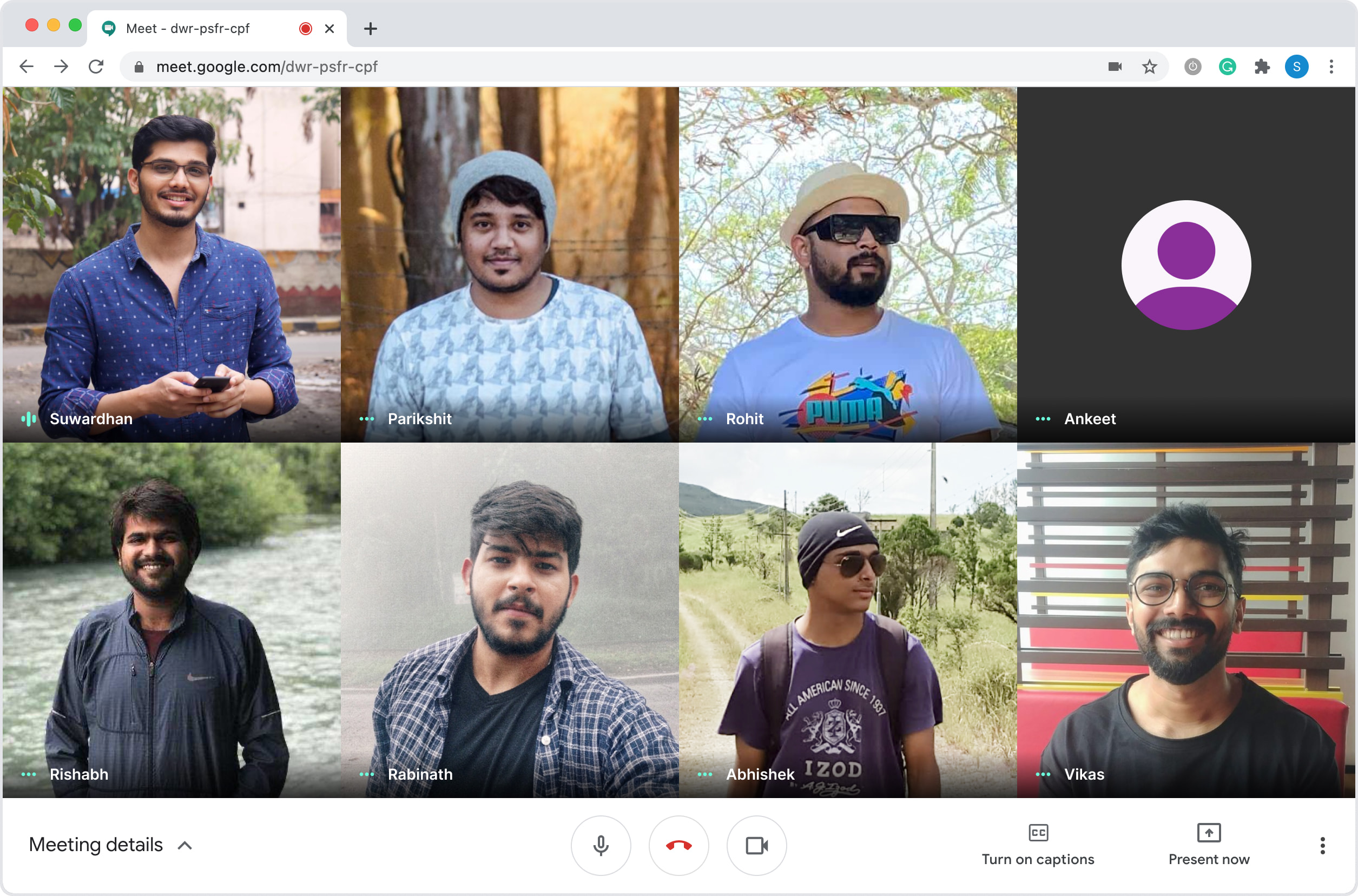
Special mention to Parikshit, Rohit and Ankeet from the design team, and Rishabh, Rabinath, Vikas and Abhishek from the dev team who worked closely with me on this. Incredibly proud that the team was able to successfully carry out the entire project till now working from home.
Get in touch → suwardhan@gmail.com