From a wall of charts to a report
Clarisights is a tool marketing teams use to see how their ads are doing: what they spent on Google and Facebook, what came back in sales, which campaigns are working. The numbers were there. What the company actually cared about often was not. Brand, region, product line - the way the team talked about the work - lived inside each report, or in a spreadsheet, or with whoever built the last version. The reading of those numbers lived somewhere else again: Slack, email, a meeting that nobody wrote down.
I redesigned how a report is built, and where those definitions live. The working prototype was the artefact I took to customers to validate the new report, and the one I handed to engineering.
The product
A report in Clarisights was a page of widgets: a chart, a table, another chart. Country or campaign down the side. Spend, clicks, revenue across the top.
The team did not think in campaign IDs. They thought in Brand, region, prospecting vs retargeting. Those names were not in the data. Each report set them up for itself - Custom Dimensions, a rule written once per ad platform. And once the widgets were on the page, the conversation still left: Slack, email, a meeting. I had already shipped a better editor for those rules. It did not change the report.
The report as a document
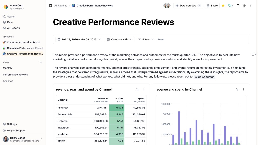
A nicer widget layout would still have been a wall of charts. The work I wanted in the product was the argument: what you are looking at, why it moved, what you decided. That is a document, not a dashboard.
In the redesign you write as you go. A heading, then a chart. Notes under a table. Tabs when one report is doing two jobs. Filters that apply to a section, not only to the whole page. The sequence is the point. Someone else should be able to open it and follow the thinking, not just stare at tiles.
Comments sit on that document. You can leave a note on a number, pull someone in with @, reply, and mark it resolved when the question is closed. The comment is not the feature. The feature is that the team's reading of the numbers stays with the numbers, instead of disappearing into a thread.
What sits under a report
A document is only useful if Brand means the same thing in every chart on it. The raw data is organized the way ad platforms send it: Facebook over here, Google over there, columns with names nobody on the marketing team uses. The team organizes their week by Brand, region, and whether they are making money. Those two ways of seeing the same activity were being glued together inside each report - which is why every report had its own Brand.
Define Brand once. Every report uses that Brand.
After
Defined underneath, reused above
- Report A document written on the shared list
- Shared list Spend, revenue, Brand, region - named the way the company talks
- Queries Turn the raw ad data into that list
- Connected data The ad platforms and the database behind them
Custom Dimensions are still there. They are just one item on the shared list.
At the bottom is the connected data: each ad platform, and the tables those numbers land in.
On top of that sit models. That is the company's name for a saved query: it takes the raw data and comes back with the numbers and groups the team actually uses - spend, revenue, Brand, region. They are written in SQL, because that data already lives in a database. Some models are the obvious joins everyone needs. Others are the cuts a given customer actually runs on.
The shared list is where people see those outputs. Spend from Google and “Brand” from a model look like the same kind of thing, so you can label them, find them, and put them on a report. Custom Dimensions become one of those items: written once, used anywhere.
A report chooses which models it is allowed to see, then you write the document on top of that list. If Brand is wrong, you fix the model. You do not rewrite Brand inside the report.
Prototype
The prototype is that product: a document-style report on top of a shared list, connected data, and models. I designed and built it so customers could try the new report, and engineering could take a complete shape instead of a deck.
What a customer can do here that they could not do with widgets: write this week's point above the chart, keep two jobs in one report with tabs, filter one section without resetting the page, and leave a question on a number - @ the person who owns it, resolve it when it is closed. Brand is picked from the list a model already produced. It is not configured in the report.
What engineering gets is the same structure: a report made of blocks (heading, notes, chart, table, tabs, comments) that can only use what a model puts on the list. If Brand is wrong, you change the model. I did not ask them to invent another widget type, or to put the rules back in the report.
What I left out of the artefact: adding a new ad platform from the UI, and saving a report as a view. Both are marked as later. The prototype is for the report and the model. The rest can wait until those two hold up.
What I was after
Someone should be able to open a report, follow the thinking, and trust that Brand means the same thing it meant this morning. The explanation should still be there next week. That is a different product than a page of widgets with the rules hiding in a form behind it.
The prototype is that product, in a form customers could try and engineering could take.
• • • •